Website homepage - Production log


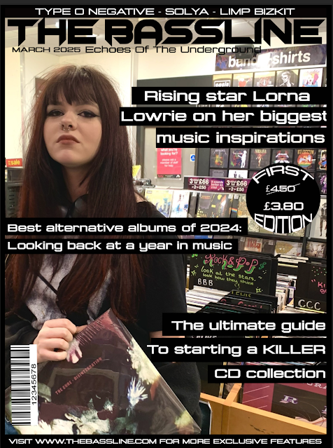
When I was producing the home page of my magazine's website, I was conscious of  creating digital convergence with the front covers and contents page of my magazine. Because of this, I used the same fonts as my front cover (Chopsic and Konexy pro) and I created both a "Latest Features" and "Music news" section where I incorporated some of the same stories as my second contents page. I also advertised the front covers on the website as well as featuring the model of my second front cover in my audio-visual content. I also wanted to appeal to my target audience, 16 - 24 year olds, who are generally more likely to be digital natives so I advertised the magazine's social media accounts to encourage the audience to further interact with the magazine. I also included my masthead, a header and an editor's welcome to conform to what a typical, new magazine would feature on their website. Further, I made a fake Ticketmaster advert, including an original photo, to further appeal to music fans as well as creating a sense of verisimilitude.

Contents page 2 - Production log


Production Task One - Photography for first cover


For the photography for my first front cover, I used a male model and used the prop of the guitar to quickly communicate that it's a music magazine. I used a white/plain background so that the text I insert over it will stand out more and be more eye catching. I used a picture on my contents page from the same photoshoot as my main image to create anchorage between the main cover and contents page and to link to the main story. I also took a picture of CD's for my contents page as one of my coverlines is based around CD collecting. I directed my model to play the guitar in the main image and to act like he was in a conversation in the image for the contents page as the main coverline mentions an interview with him. 


Main image -


Contents page images -


Planning Task 8 : Photography Planning

For my original images, I'm going to take them myself with my phone. My models will cover two different social groups as I'm using a girl and a guy for the respective editions. For my first edition, the model will be male. The setting of the photos will be a skate park to create anchorage with the main coverline of the second edition, which mentions 'skate punk'. Along with this, I will use a prop of a skateboard to emphasise the anchorage created. The model will wear dark red and black as these are colours often associated with rock music genres, the masthead will be dark red to match this and create a sense of uniformity. The picture will be taken from a slight low to high angle and make use of direct gaze to communicate ideas of power and confidence to the audience


For my second edition, I'm using a female model and the background will be an indoor setting. I'm not using any props for my second edition and my model will wear dark purple as it's commonly associated with rock/alternative music and it will match the masthead's colour. The model will use direct gaze with the camera to communicate a sense of confidence to the audience. The lighting and background will be bright white to create a contrast with the dark colours used in the costume and masthead.


I will also take a picture of some CDs for my contents page as it will correlate to one of my coverlines which mentions CD collecting to make my images relevant to the content of my magazine. For one other image for my respective contents pages, I will use variants of the main image on the front cover to create uniformity and caption them with directions to the page of the story.

Website homepage - Production log

  When I was producing the home page of my magazine's website, I was conscious of  creating digital convergence with the front covers an...